Grammar of graphics
Lecture 2
ggplot2 \(\in\) tidyverse
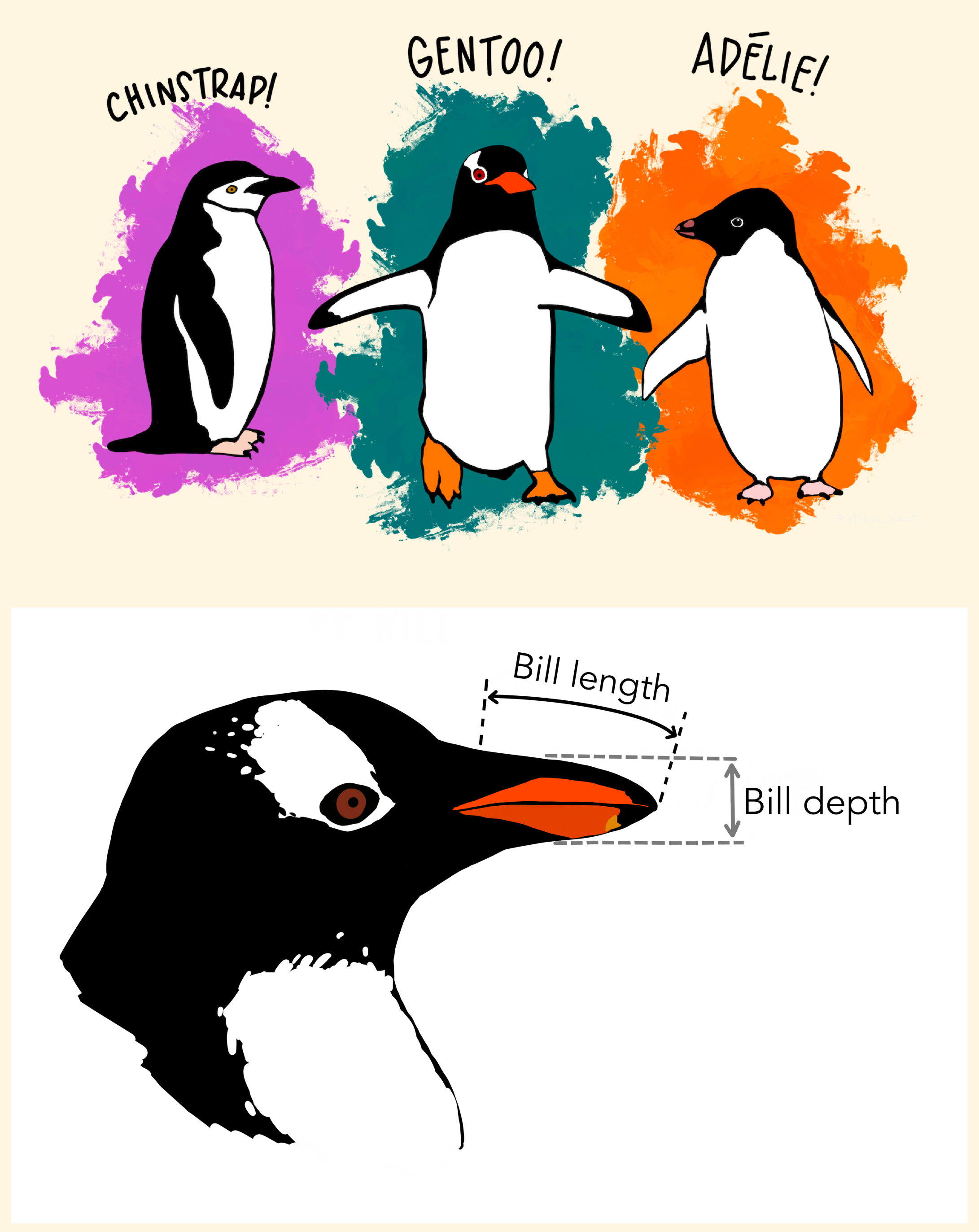
Data: Palmer Penguins
Measurements for penguin species, island in Palmer Archipelago, size (flipper length, body mass, bill dimensions), and sex.
Rows: 344
Columns: 8
$ species           <fct> Adelie, Adelie, Adelie, Adelie, Adelie, Adelie, Adelie, Adelie, Adelie, Adelie, Adelie, Adelie, Adelie, Adelie, Adelie, Adelie, Adelie, Adelie, Adelie, Adelie, Adelie, Adel…
$ island            <fct> Torgersen, Torgersen, Torgersen, Torgersen, Torgersen, Torgersen, Torgersen, Torgersen, Torgersen, Torgersen, Torgersen, Torgersen, Torgersen, Torgersen, Torgersen, Torgers…
$ bill_length_mm    <dbl> 39.1, 39.5, 40.3, NA, 36.7, 39.3, 38.9, 39.2, 34.1, 42.0, 37.8, 37.8, 41.1, 38.6, 34.6, 36.6, 38.7, 42.5, 34.4, 46.0, 37.8, 37.7, 35.9, 38.2, 38.8, 35.3, 40.6, 40.5, 37.9, …
$ bill_depth_mm     <dbl> 18.7, 17.4, 18.0, NA, 19.3, 20.6, 17.8, 19.6, 18.1, 20.2, 17.1, 17.3, 17.6, 21.2, 21.1, 17.8, 19.0, 20.7, 18.4, 21.5, 18.3, 18.7, 19.2, 18.1, 17.2, 18.9, 18.6, 17.9, 18.6, …
$ flipper_length_mm <int> 181, 186, 195, NA, 193, 190, 181, 195, 193, 190, 186, 180, 182, 191, 198, 185, 195, 197, 184, 194, 174, 180, 189, 185, 180, 187, 183, 187, 172, 180, 178, 178, 188, 184, 195…
$ body_mass_g       <int> 3750, 3800, 3250, NA, 3450, 3650, 3625, 4675, 3475, 4250, 3300, 3700, 3200, 3800, 4400, 3700, 3450, 4500, 3325, 4200, 3400, 3600, 3800, 3950, 3800, 3800, 3550, 3200, 3150, …
$ sex               <fct> male, female, female, NA, female, male, female, male, NA, NA, NA, NA, female, male, male, female, female, male, female, male, female, male, female, male, male, female, male…
$ year              <int> 2007, 2007, 2007, 2007, 2007, 2007, 2007, 2007, 2007, 2007, 2007, 2007, 2007, 2007, 2007, 2007, 2007, 2007, 2007, 2007, 2007, 2007, 2007, 2007, 2007, 2007, 2007, 2007, 2007…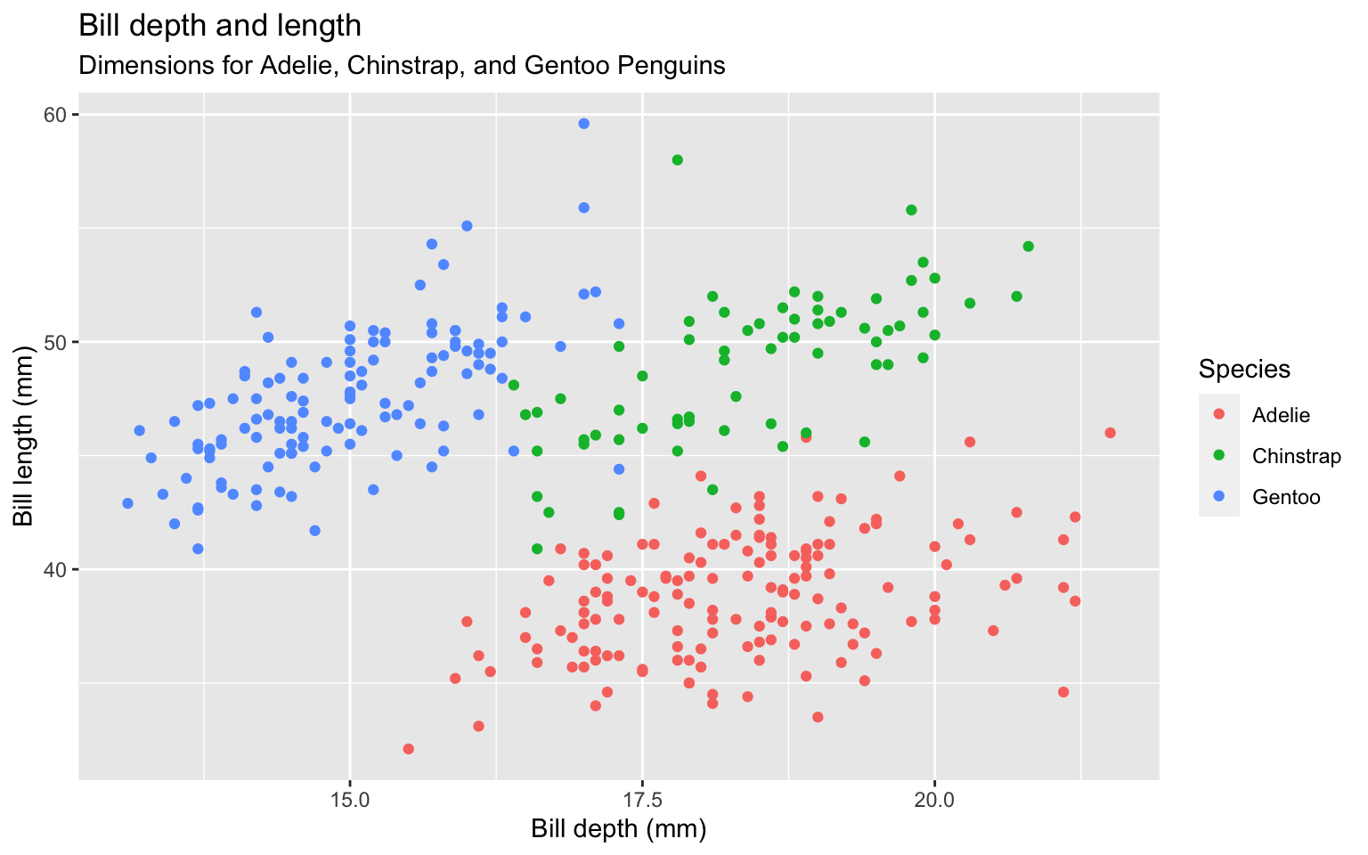
Start with the
penguinsdata frame

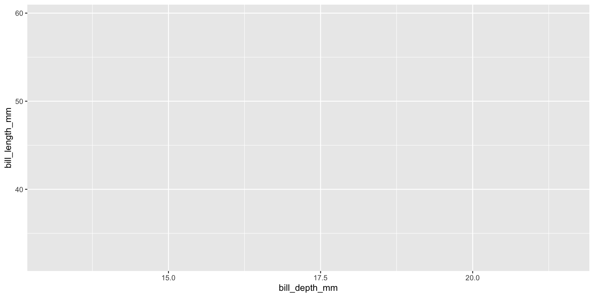
Start with the
penguinsdata frame, map bill depth to the x-axis
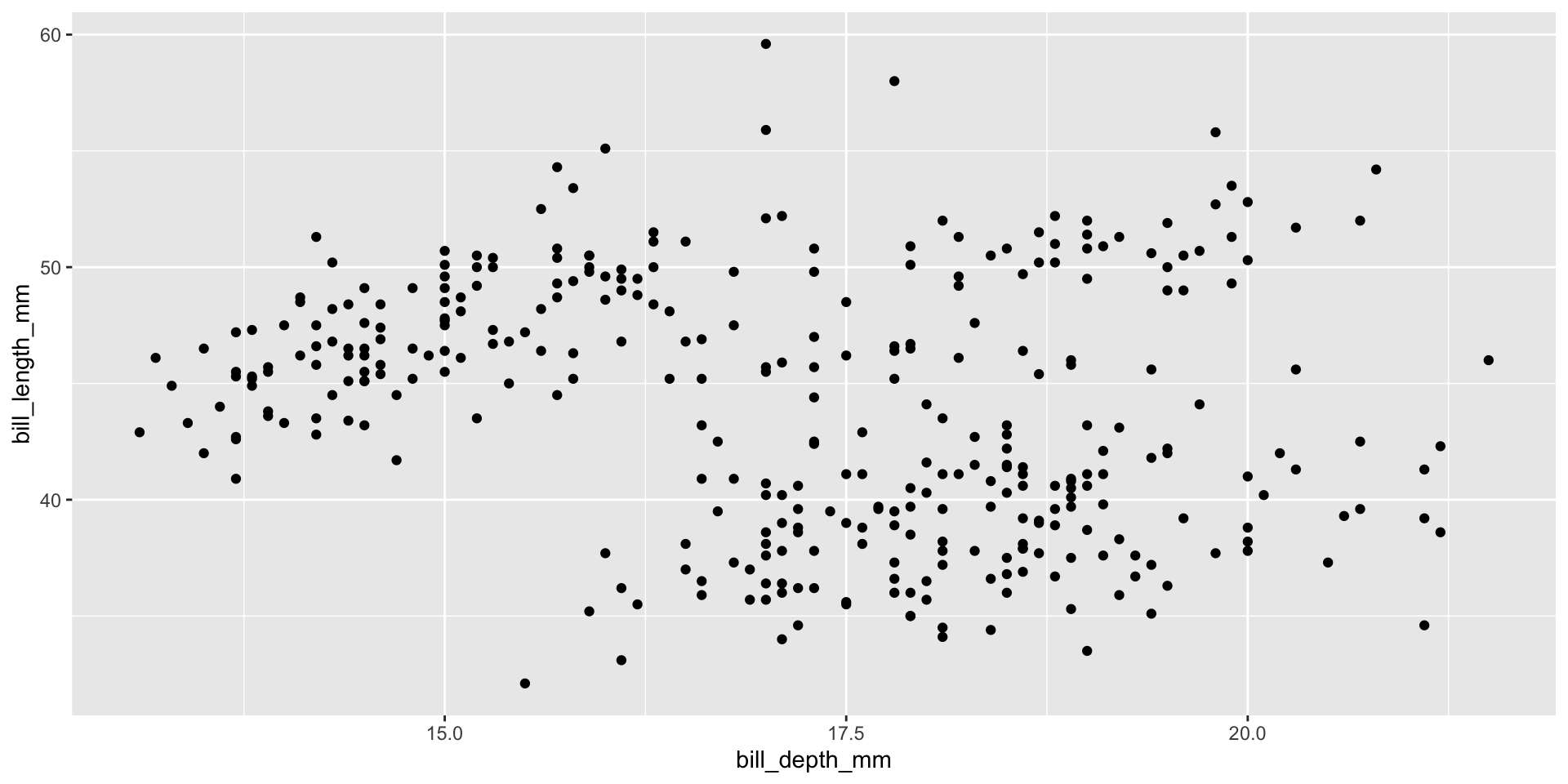
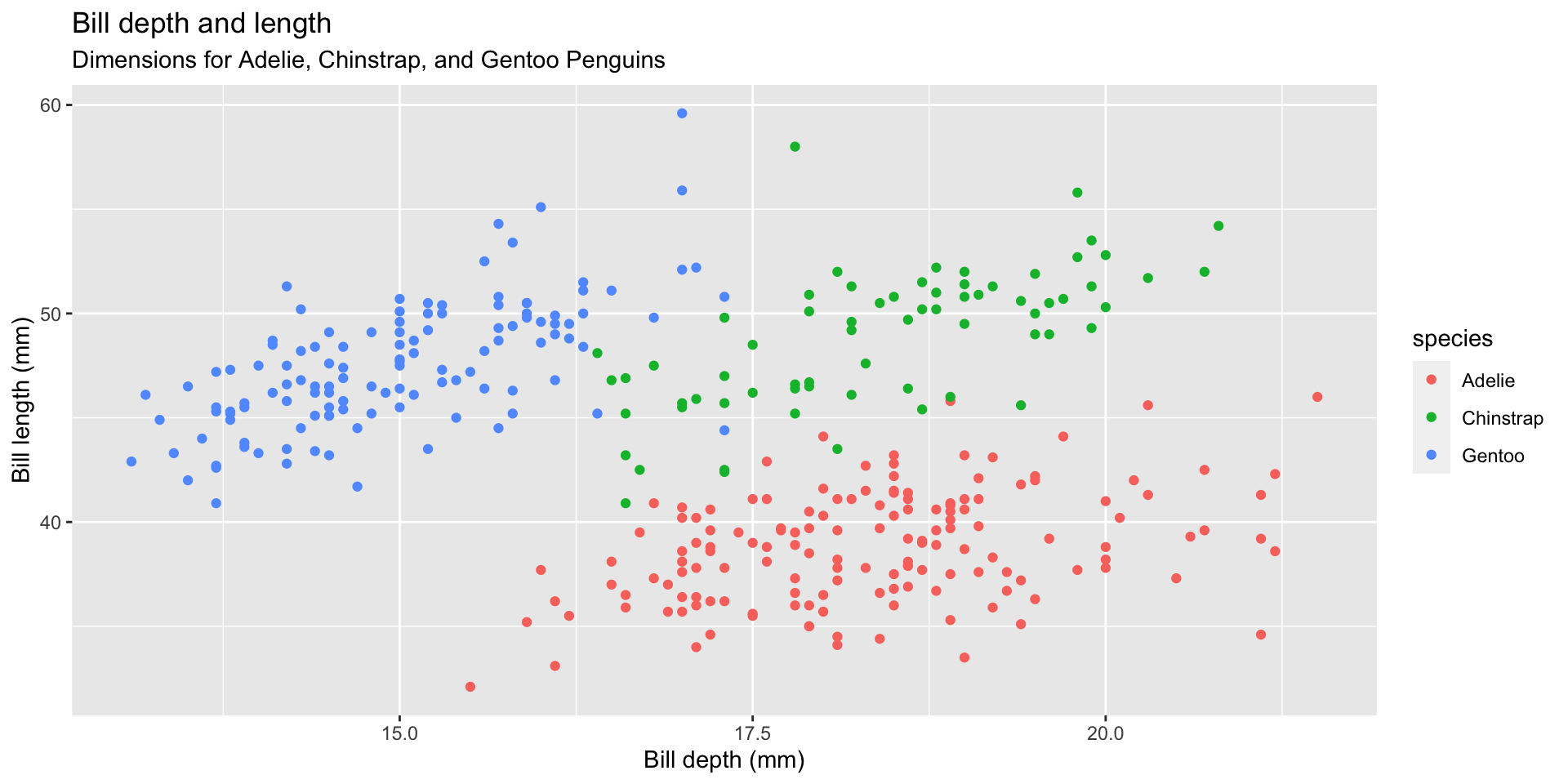
Start with the
penguinsdata frame, map bill depth to the x-axis and map bill length to the y-axis.
Start with the
penguinsdata frame, map bill depth to the x-axis and map bill length to the y-axis. Represent each observation with a point
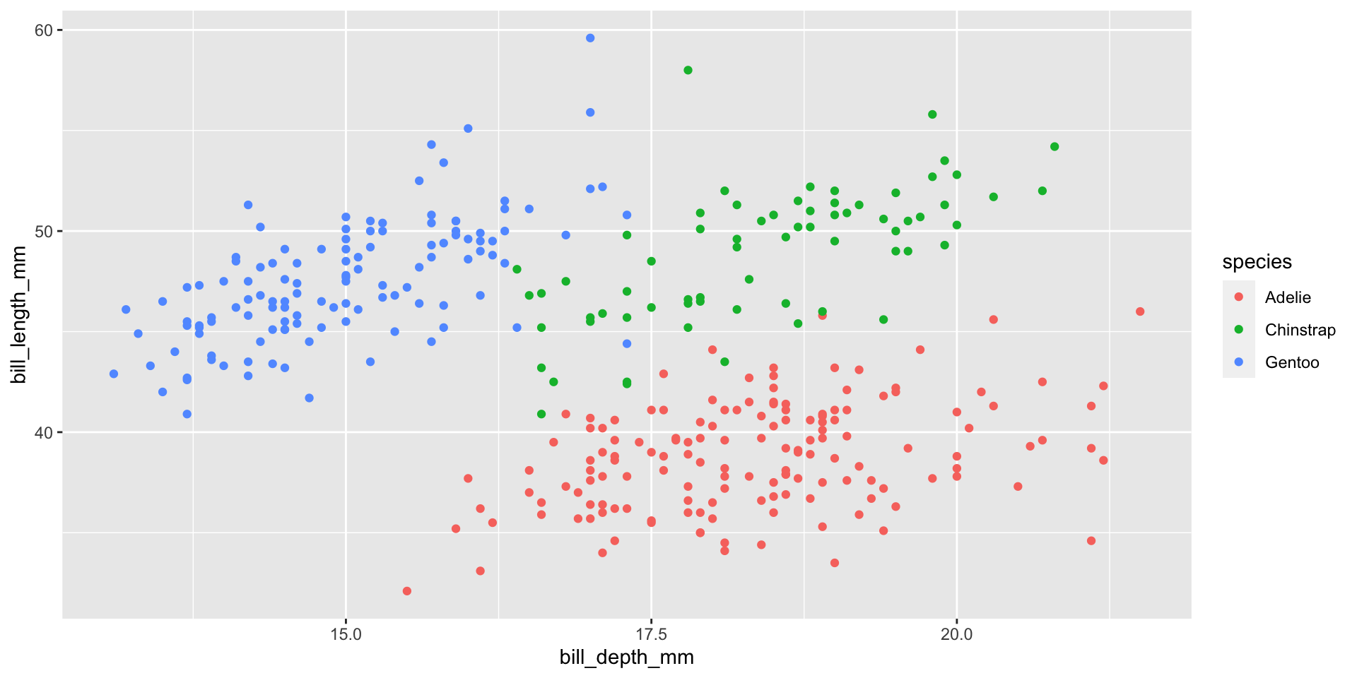
Start with the
penguinsdata frame, map bill depth to the x-axis and map bill length to the y-axis. Represent each observation with a point and map species to the color of each point.
Start with the
penguinsdata frame, map bill depth to the x-axis and map bill length to the y-axis. Represent each observation with a point and map species to the color of each point. Title the plot “Bill depth and length”
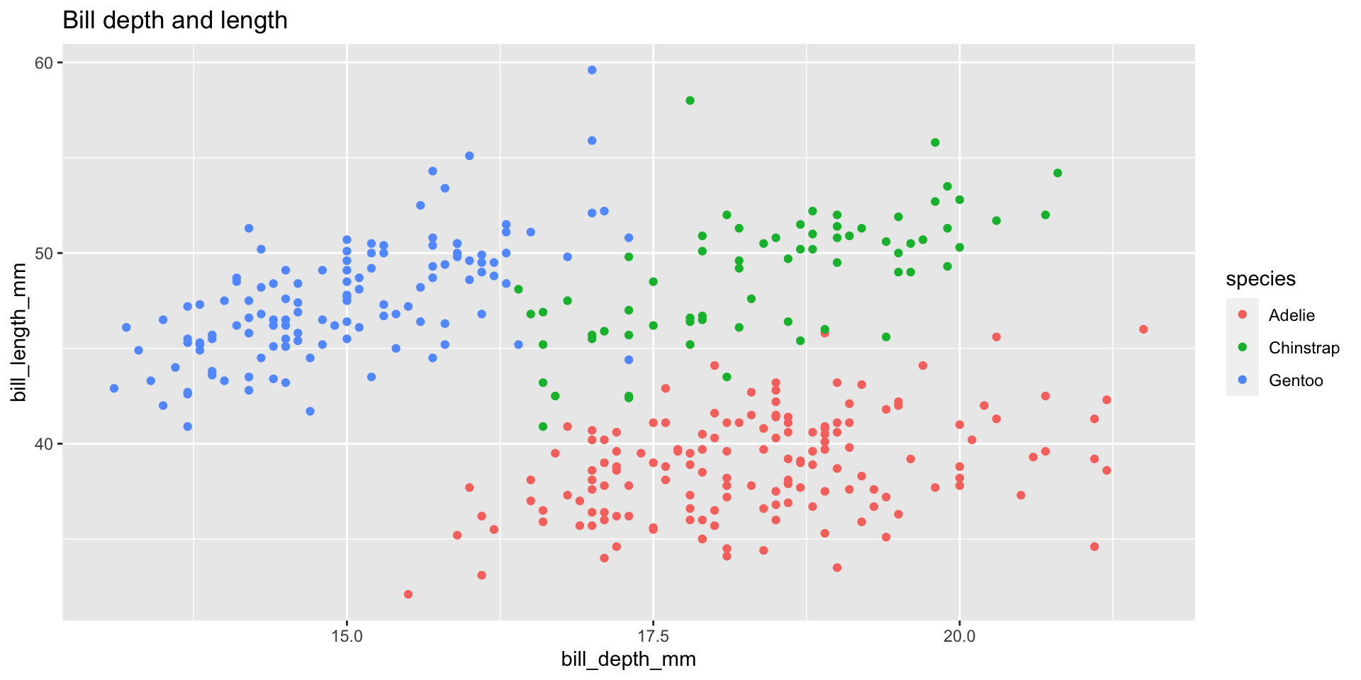
Start with the
penguinsdata frame, map bill depth to the x-axis and map bill length to the y-axis. Represent each observation with a point and map species to the color of each point. Title the plot “Bill depth and length”, add the subtitle “Dimensions for Adelie, Chinstrap, and Gentoo Penguins”

Start with the
penguinsdata frame, map bill depth to the x-axis and map bill length to the y-axis. Represent each observation with a point and map species to the color of each point. Title the plot “Bill depth and length”, add the subtitle “Dimensions for Adelie, Chinstrap, and Gentoo Penguins”, label the x and y axes as “Bill depth (mm)” and “Bill length (mm)”, respectively
Start with the
penguinsdata frame, map bill depth to the x-axis and map bill length to the y-axis. Represent each observation with a point and map species to the color of each point. Title the plot “Bill depth and length”, add the subtitle “Dimensions for Adelie, Chinstrap, and Gentoo Penguins”, label the x and y axes as “Bill depth (mm)” and “Bill length (mm)”, respectively, label the legend “Species”

Start with the
penguinsdata frame, map bill depth to the x-axis and map bill length to the y-axis. Represent each observation with a point and map species to the color of each point. Title the plot “Bill depth and length”, add the subtitle “Dimensions for Adelie, Chinstrap, and Gentoo Penguins”, label the x and y axes as “Bill depth (mm)” and “Bill length (mm)”, respectively, label the legend “Species”, and add a caption for the data source.
ggplot(data = penguins,
       mapping = aes(x = bill_depth_mm,
                     y = bill_length_mm,
                     color = species)) +
geom_point() +
labs(title = "Bill depth and length",
subtitle = "Dimensions for Adelie, Chinstrap, and Gentoo Penguins",
x = "Bill depth (mm)", y = "Bill length (mm)",
color = "Species",
caption = "Source: Palmer Station LTER / palmerpenguins package")
Start with the
penguinsdata frame, map bill depth to the x-axis and map bill length to the y-axis. Represent each observation with a point and map species to the color of each point. Title the plot “Bill depth and length”, add the subtitle “Dimensions for Adelie, Chinstrap, and Gentoo Penguins”, label the x and y axes as “Bill depth (mm)” and “Bill length (mm)”, respectively, label the legend “Species”, and add a caption for the data source. Finally, use a discrete color scale that is designed to be perceived by viewers with common forms of color blindness.
ggplot(data = penguins,
       mapping = aes(x = bill_depth_mm,
                     y = bill_length_mm,
                     color = species)) +
  geom_point() +
  labs(title = "Bill depth and length",
       subtitle = "Dimensions for Adelie, Chinstrap, and Gentoo Penguins",
       x = "Bill depth (mm)", y = "Bill length (mm)",
       color = "Species",
caption = "Source: Palmer Station LTER / palmerpenguins package") +
scale_color_viridis_d()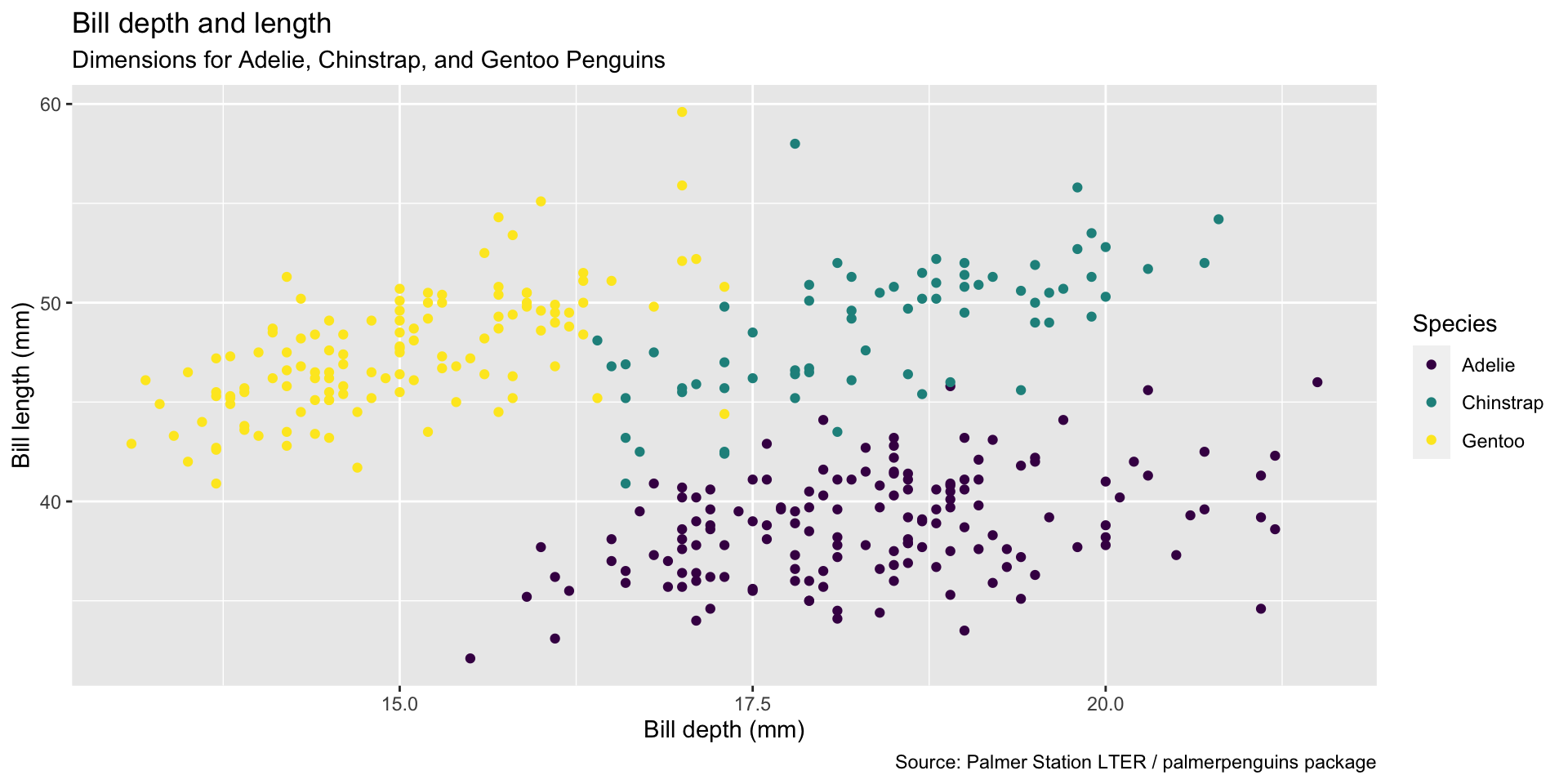
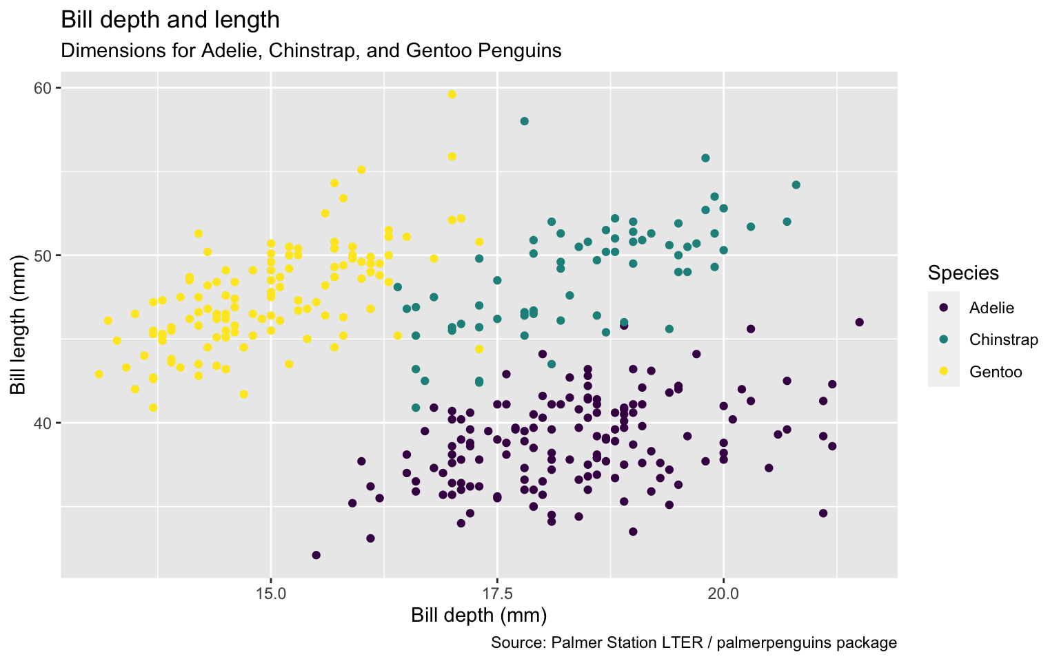
ggplot(data = penguins,
       mapping = aes(x = bill_depth_mm,
                     y = bill_length_mm,
                     color = species)) +
  geom_point() +
  labs(title = "Bill depth and length",
       subtitle = "Dimensions for Adelie, Chinstrap, and Gentoo Penguins",
       x = "Bill depth (mm)", y = "Bill length (mm)",
       color = "Species",
       caption = "Source: Palmer Station LTER / palmerpenguins package") +
scale_color_viridis_d()Start with the penguins data frame, map bill depth to the x-axis and map bill length to the y-axis.
Represent each observation with a point and map species to the color of each point.
Title the plot “Bill depth and length”, add the subtitle “Dimensions for Adelie, Chinstrap, and Gentoo Penguins”, label the x and y axes as “Bill depth (mm)” and “Bill length (mm)”, respectively, label the legend “Species”, and add a caption for the data source.
Finally, use a discrete color scale that is designed to be perceived by viewers with common forms of color blindness.
More slides
Add more slides as needed…